Evolving a design system

00

Overview


I was the lead content designer on this project for ShareFile from 2023 - 2024. I worked with a design director, 3 product designers, a brand designer, and a dedicated design system engineering team.

01

Context


After spending 12 years in Citrix’s shadow, ShareFile needed to dust off its design system to improve user experience and stand out from competitors.

ShareFile is a B2B SaaS company with over 3 million monthly active users that serves both enterprise and SMB customers. It was owned by Citrix from 2011 to 2023, and in that time, it utilized their design system. After being acquired by Cloud Software Group, it needed to find its identity, its brand, and its design system again.

We assembled a cross-disciplinary team of designers and engineers to tackle the problem. At the onset of this project, we decided to build off Ant Design (a UI framework) rather than creating an entire library of components from scratch.

My responsibilities were to craft usage guidelines, to manage documentation, and to evolve our design system landscape by introducing system-level content design.

02

Prioritizing


Our first step was to prioritize. Our core team met, went through the list of everything that the design system needed to cover, and rated each element based on how urgently we needed it defined and documented. We then grouped elements with the same rating into waves for us to tackle.

03

System-level content


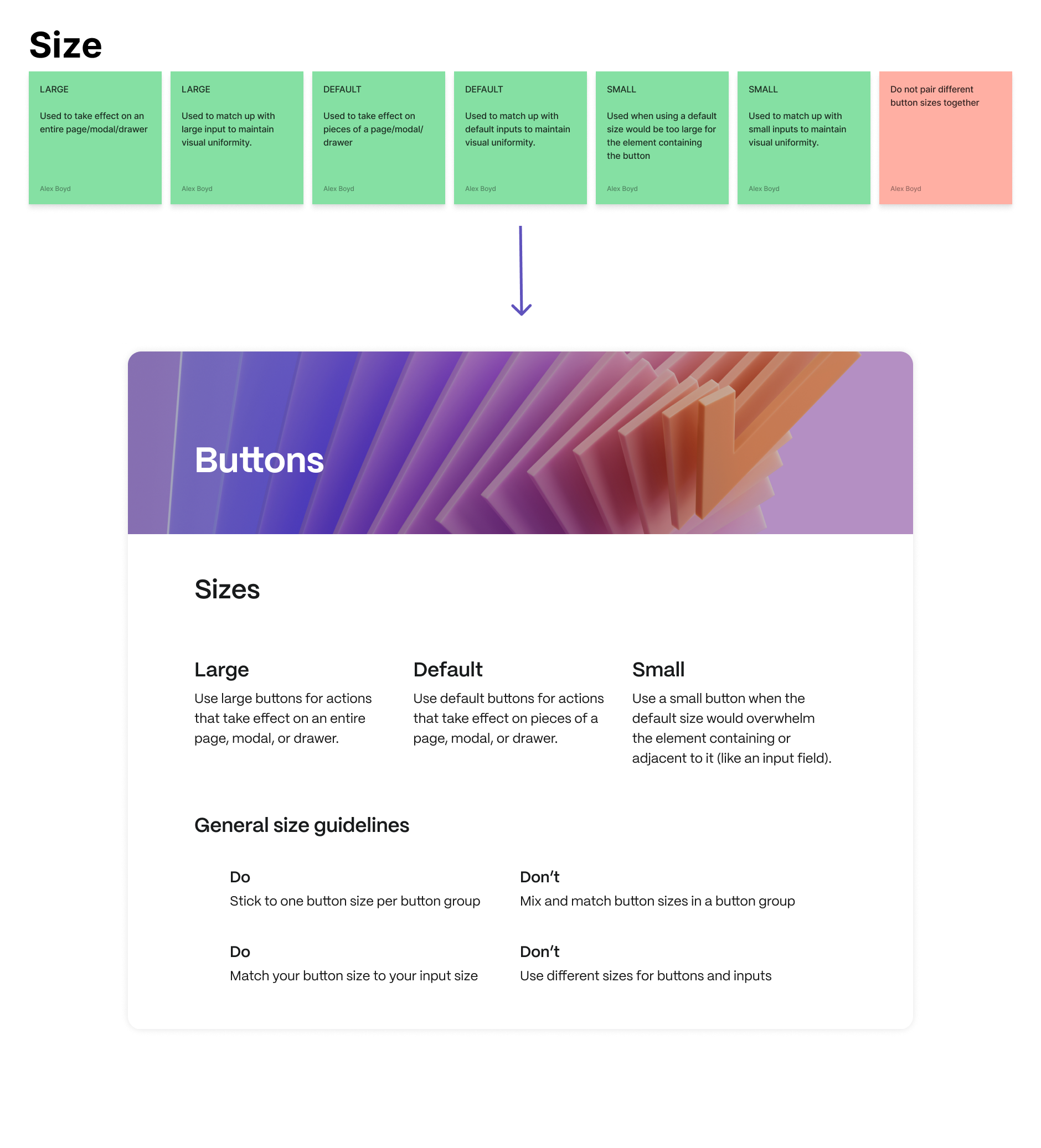
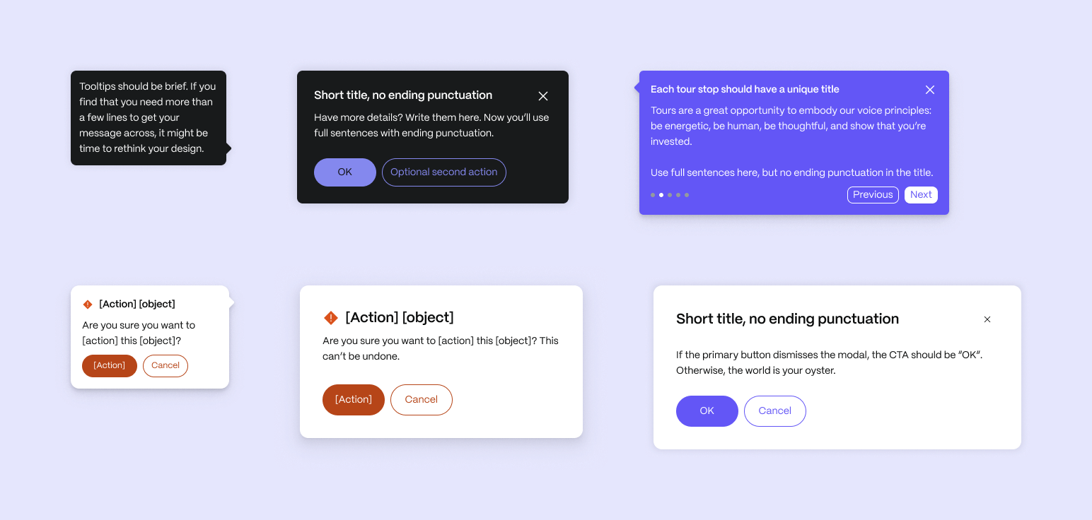
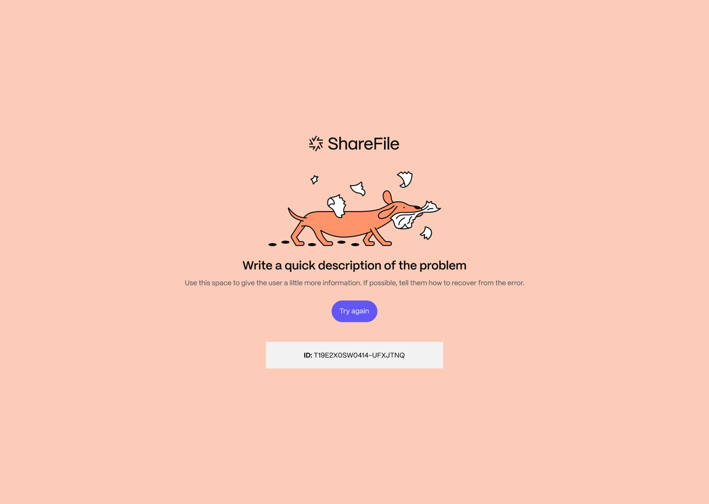
While the lead product designer drafted specs for foundational UI elements (color, typography, the grid, etc.), I laid out the foundations for content at a macro level.

Content design was new to ShareFile. Content in the app was all over the place—we were constantly switching back and forth between passive voice and active voice, title case and sentence case, American and British English… the list was endless. The ancestral design system that we inherited from Citrix had no content guidelines, and as the first and only content designer in the org, creating them was my biggest priority.

I did some research into how other design systems incorporated content. Did we need our own content design system like Intuit? A content guide within our foundations like Material Design? Or should I embed content standards in each component’s documentation like Atlassian does?

I landed on first creating high-level, broad guidelines that could apply to any content within the product. Down the road when it was time to write component-level usage guidelines, I’d make sure each had a content section.

I had been holding Content Design Office Hours for a year at this point, and I knew which topics came up with designers most frequently. I made sure all of those sticking points were covered.

Once I had a solid draft, I solicited feedback from designers on the team to ensure it met their needs.

After a couple of iterations, I tested the guidelines by launching a 4-month experiment where I went on maternity leave and left the design team to fend for themselves.

04

Micro-level content


Once the UI foundations were ready, I simply went through and made sure the documentation was digestible (and consistent with our new content standards)... but when it came time to document our first wave of components, the process was a little more involved.

All of the product designers in our org divided and conquered. Each taking a component, they audited its current use in the application and came up with rough design recommendations. I then took these recommendations and used them to create guidelines and usage guidance.

In addition to providing usage and content guidance, I highlighted requirements from our accessibility vendor and called out any ways that we deviated from Ant Design.

I also used this as an opportunity to inject content guidelines at the component-level. Whenever possible, I used visual examples and altered the library component in Figma so that it was readily available whenever a designer went to use it.

05

Patterns


I realized that even after the implementation of content guidelines, we were still seeing a lot of variances in product for experiences that should really be consistent. To mitigate this, I made content frameworks for common patterns like error pages, empty states, and confirmation modals.

06

Outcomes


  We expedited design and development  
The new components and their guidelines allowed both designers and developers to get their day to day work done faster and freed up more time for strategic initiatives.

  We made our product more consistent  
The component and pattern guidelines helped us smooth out what was previously a bumpy, disjointed experience.

  We made our product WCAG 2.1 AA compliant  
During this initiative, we updated all of our components so that they met the standards of AA compliance. This meant more people—whether as our customers, or our customers’ customers—could use our product successfully.